
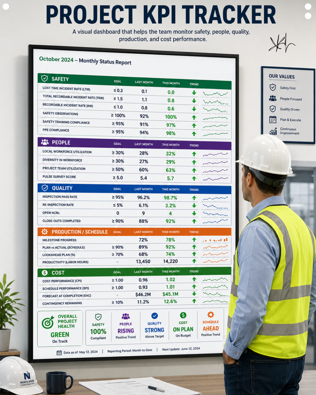
The Project KPI Tracker: Why What Gets Seen Gets Done
What gets measured gets managed. What gets seen gets done.
Here is the deal. The best teams do not bury performance in a spreadsheet nobody opens. They put it on the wall. A single visual dashboard covering safety, people, quality, production, and cost turns abstract goals into a daily conversation. Red means act. Green means keep pushing. Trends tell you where you are headed before the numbers catch up. That last part matters more than most project teams realize, because a dashboard that only shows where you stand today is a snapshot. A dashboard that shows the trend is a warning system.
The Pain of Data That Nobody Looks At
Most projects already track everything on this dashboard. Safety incident rates exist in a report. Quality inspection pass rates exist in a spreadsheet. Schedule performance exists in scheduling software. Cost performance exists in a monthly report the project executive reviews. The data is not missing. What is missing is a place where that data lives visibly, continuously, in front of the people whose daily decisions actually move the numbers.
A metric that exists in a spreadsheet gets reviewed once a month, usually by someone several layers removed from the daily work that produces the number. By the time a declining trend surfaces in that monthly review, it has been declining for weeks, and the conversation about it happens well after the window for an easy correction has closed. The foreman who could have addressed a rising rework rate three weeks ago never saw the number, because the number lived in a report designed for an executive audience rather than a wall designed for a field team.
This is the quiet cost of reporting instead of displaying. The information exists, technically. It is accurate, technically. But it arrives too late and reaches the wrong audience to actually change behavior while the behavior is still changeable.
The Failure Pattern
The failure pattern is treating performance data as a reporting obligation rather than a daily management tool.
Reports are built for accountability after the fact. They tell an executive or an owner what happened last month, and they are structured to explain, justify, and summarize. That function is legitimate and necessary. But a report is inherently backward-looking, and a monthly cadence means the feedback loop between a behavior and its consequence is weeks long. A crew’s rework rate that started climbing in week one of a phase does not show up in a formal report until the phase is largely complete, at which point the opportunity to correct it within that phase has already passed.
A dashboard changes the cadence and the audience. It updates more frequently, it lives where the field team works, and it is designed to prompt action today rather than explain results after the fact. The same data, displayed differently, produces a completely different behavioral response. Nobody changes their approach because of a number in a report they will see in three weeks. People do change their approach because of a number on the wall they walk past every morning.
They Didn’t Fail the System
When a project’s quality or safety numbers decline gradually over a phase without anyone catching it early, the instinct is to ask why the team did not notice sooner. Why didn’t the foreman flag the rising re-inspection rate? Why didn’t the safety lead see the trend before it became a real problem?
The honest answer is usually that the trend was visible only in a system nobody was looking at daily. The foreman was managing the work in front of them, not cross-referencing a spreadsheet that updates monthly. The safety lead was reviewing incident reports as they came in, not tracking a rolling trend line that would have shown the direction of travel before any single incident occurred. Nobody failed to pay attention. The information was structured in a way that made early detection unlikely regardless of how attentive anyone was.
Put the same information on a wall, updated regularly, visible to the whole team every day, and the detection problem resolves itself. People do not need to remember to check a report. The report is in front of them, whether they intended to look at it or not.
What the Dashboard Actually Displays
The dashboard organizes performance into five categories, and the structure itself is part of what makes it work.
Safety metrics track lost time incident rate, total recordable incident rate, recordable incident rate, safety observations, safety training compliance, and PPE compliance, each against a specific goal with a trend line showing direction. People metrics track local workforce utilization, diversity in the workforce, project team utilization, and a pulse survey score, treating workforce health as something worth measuring with the same rigor as safety and cost. Quality metrics track inspection pass rate, re-inspection rate, open non-conformance reports, and close-out completion percentage. Production and schedule metrics track milestone progress, plan versus actual schedule performance, look-ahead plan percentage, and productivity in labor hours. Cost metrics track cost performance index, schedule performance index, forecast at completion, and contingency remaining.
Each metric carries a goal, last month’s actual, this month’s actual, and a trend line. That trend line is doing more work than either single number alone. A team hitting ninety-two percent on close-out completion this month, up from eighty-eight percent last month, is a team with positive momentum, even if ninety-two percent has not yet reached the goal. A team sitting at the goal but trending downward is a team about to miss it next month if nothing changes. The trend tells you where the number is going, and where a number is going matters more than where it happens to sit on any single day.
Why Trends Beat Snapshots
A single month can lie. A cost performance index of exactly 1.0 this month looks fine in isolation, but if last month was 1.15 and the month before that was 1.2, the team is looking at a declining trend that a snapshot alone would completely obscure. The direction of travel tells the truth that any single data point cannot.
This is why the dashboard’s design, showing last month, this month, and a trend line side by side for every metric, is not a cosmetic choice. It is the mechanism that turns data into a leading indicator instead of a lagging one. A leading indicator gives the team time to respond before a problem becomes a crisis. A lagging indicator only confirms, after the fact, that a crisis has already happened. Every team wants leading indicators. Very few teams build the display structure that actually produces them.
Why Visibility Builds Ownership
There is a behavioral principle underlying this entire practice that goes beyond the mechanics of data display. When everyone can see the score, everyone plays to win.
A crew that has no visibility into how their work contributes to the project’s overall quality or safety performance experiences their work as isolated tasks disconnected from a larger outcome. A crew that walks past a dashboard every day showing the project’s inspection pass rate, and understands that their work directly moves that number, experiences their work differently. They are not just installing material. They are contributing to a score the whole team is tracking together, and that shift from isolated task to shared outcome is what visibility actually produces.
This is the same principle behind the Circle of Trust and contractor grading. Performance that stays private, known only to the people directly responsible for reviewing it, produces isolated accountability. Performance that becomes visible to the whole team produces collective ownership. A trade partner who knows their grade is posted, or a crew that knows the project’s safety trend is on a wall they walk past daily, behaves differently than a team whose performance exists only in a report reviewed by people they rarely interact with.
Signals Your Project Needs a Visual Dashboard
Look for these patterns before deciding whether this practice would help your project:
- Performance problems are being discovered during monthly reviews rather than caught early in the field
- Different levels of the project team have access to different pieces of performance data, with no single shared view
- Metrics exist in multiple disconnected spreadsheets and reports rather than one consolidated view
- Field teams do not know how their daily work connects to overall project performance metrics
- The team’s conversation about performance happens reactively, after a number has already declined, rather than proactively based on a visible trend
Each of these signals a visibility gap, and a visibility gap is exactly what a wall-mounted dashboard is designed to close.
Green Is Not the Goal
The instinct when building a dashboard like this is to treat green as the finish line, the state you reach and then relax. That instinct misses the actual purpose of the tool. The target is always the same: better than last month. A metric sitting at green with a flat or declining trend is a metric one bad week away from turning yellow. A metric sitting at yellow with a strong positive trend is a team that is clearly closing the gap and should be recognized for the direction they are moving, not just the number they currently show.
Momentum, not status, is what the dashboard is actually built to track. That reframing matters because a team fixated on hitting a static target will stop pushing the moment they cross the threshold. A team fixated on maintaining positive momentum keeps improving even after they have technically met the goal, because the measure of success was never the finish line. It was always the direction of travel.
Displaying Performance Instead of Reporting It
Stop reporting performance after the fact. Start displaying it in real time, and watch your team rise to meet it. This is the same discipline behind every visual management practice in Lean construction: the Circle of Trust, the situation room, quality-at-the-source floor markings, contractor grading. Every one of these tools works on the same principle. Make performance visible to the people who can act on it, at a cadence fast enough to matter, and the behavior changes without requiring anyone to force it. If your project needs superintendent coaching, project support, or leadership development, Elevate Construction can help your field teams stabilize, schedule, and flow. Jason Schroeder and the LeanTakt team build visual dashboards like this into every project because the discipline of displaying performance, rather than merely reporting it, is one of the highest-leverage changes a leadership team can make.
Put the Score on the Wall
Here is your challenge. Pick the five or six metrics that matter most on your project right now, across safety, people, quality, production, and cost. Build a simple version of this dashboard, even a whiteboard update weekly, and put it somewhere the whole team walks past every day. Do not wait for a polished digital version. Start with what you can build this week.
Taiichi Ohno taught that visibility is the foundation every improvement depends on, because a team cannot fix what it cannot see. Put your project’s performance where everyone can see it, every day, and watch how quickly the team starts managing toward the trend instead of waiting for the monthly report to tell them what already happened.
On we go.
FAQ
How often should a project dashboard like this be updated?
Monthly is the minimum useful cadence for capturing trend direction, but weekly updates on the metrics that change most quickly, such as safety observations or schedule performance, give the team a faster feedback loop. The right cadence depends on how quickly each specific metric can meaningfully change and how much lead time the team needs to respond before a declining trend becomes a serious problem.
Who should be responsible for maintaining and updating the dashboard?
A single owner, often a project engineer or project controls lead, should own the data collection and update process to ensure consistency and accuracy. Shared ownership across multiple people tends to produce gaps and inconsistent updates, the same failure pattern that affects unmanaged storage or unmaintained fencing. One accountable owner keeps the system reliable.
What should a team do when a metric shows a declining trend?
Treat a declining trend as an early warning rather than waiting for the metric to cross into a red or failing threshold. The whole value of trend-based tracking is catching problems while they are still small and correctable. A team that waits until a metric is already failing before discussing it has lost the main advantage a visual dashboard provides over a monthly report.
If you want to learn more we have:
-Takt Virtual Training: (Click here)
-Check out our Youtube channel for more info: (Click here)
-Listen to the Elevate Construction podcast: (Click here)
-Check out our training programs and certifications: (Click here)
-The Takt Book: (Click here)
Discover Jason’s Expertise:
Meet Jason Schroeder, the driving force behind Elevate Construction IST. As the company’s owner and principal consultant, he’s dedicated to taking construction to new heights. With a wealth of industry experience, he’s crafted the Field Engineer Boot Camp and Superintendent Boot Camp – intensive training programs engineered to cultivate top-tier leaders capable of steering their teams towards success. Jason’s vision? To expand his training initiatives across the nation, empowering construction firms to soar to unprecedented levels of excellence.